
Color Psychology in Office Furniture: Why Your Chair and Desk Color Choices Matter More Than You Think
- 13 Oct, 2026
- Guides
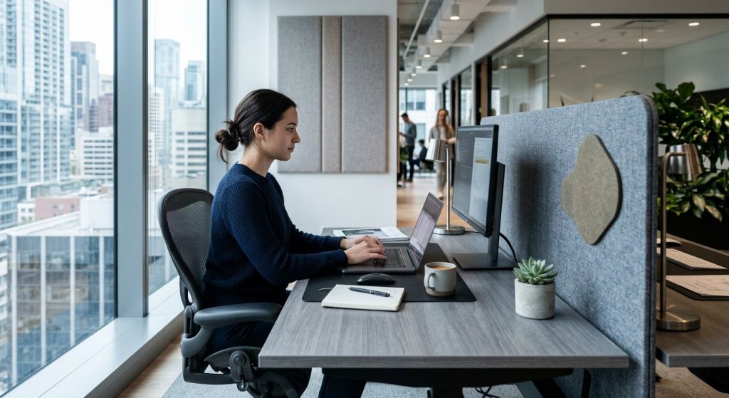
Color choices in office furniture matter because they affect light reflection, visual fatigue, and perceived energy levels in a space, not just mood. The right furniture color depends on what happens in that zone: calming blues and greens for focus areas, warmer tones for collaboration spaces, and neutral, low-glare finishes for screen-heavy desks, all layered with lighting and material texture rather than chosen in isolation. Get the color wrong and you add friction to every eight-hour shift that happens in that room.
Key takeaways
- Furniture color affects glare, visual fatigue, and perceived room size through light reflectance, not just mood, and furniture sits closer to the eye than wall paint so it matters more.
- Cool, low-saturation, matte tones belong on deep-focus desks to reduce glare, while warmer tones work better in collaboration and breakroom furniture.
- Avoid high-gloss white under LED panels, very dark matte desktops next to bright screens, oversaturated colors on large surfaces, and mismatched warm/cool undertones between pieces.
- Test furniture color under your office’s actual lighting (3000K vs 5000K) before ordering, since showroom light and office light render the same color very differently.
- Use one neutral base color per zone for structural furniture and save bold accents for small, movable pieces like a single chair or screen panel.
Why Color Isn’t Just Decoration: The Mechanism Behind the Mood
Forget the idea that color works on your brain like magic. It works through light. Darker furniture absorbs more light and can make a room feel smaller and heavier, while lighter furniture bounces light back into the space and cuts the need for extra overhead lighting. That’s a physical fact, not a vibe.
Here’s what most color guides skip: saturation matters as much as hue. A bright red cabinet sitting in your peripheral vision near a monitor creates visual noise your eyes have to process even when you’re not looking directly at it. Over a full shift, that adds up to real fatigue.
Consistency along the sightline
Color consistency across what you actually look at all day, your desk, your chair, the partition behind your screen, reduces the cognitive load of constantly readjusting your eyes. That matters far more over an 8-plus hour workday than it does in a showroom walkthrough.
One distinction worth making: wall color studies get cited constantly, but furniture color behaves differently. Furniture sits closer to your eyes and your hands. Its finish interacts directly with glare and texture in a way that wall paint ten feet away never does.

What Each Color Actually Does in a Work Setting
Mood-word lists (‘blue is calming’) are only half the story. The other half is what happens when you actually sit next to that color for a full workday.
| Color family | Effect | Best furniture use | Watch-out |
|---|---|---|---|
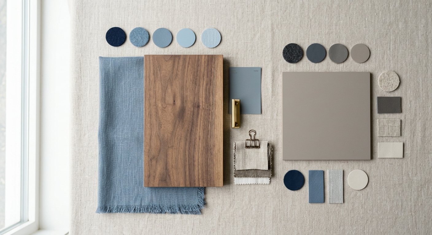
| Blue / cool green | Calm, sustained focus | Deep-work desks, quiet zones | Too much cool tone with poor natural light reads cold, sterile |
| Warm tones (orange, warm yellow) | Energy, social interaction | Breakrooms, collaboration furniture | Overuse in a small meeting room increases visual clutter and fatigue |
| Red | Alertness, urgency | Small accents only: one chair, one panel | Sustained exposure as a dominant color can heighten stress response |
| Neutral (grey, taupe, walnut, black) | Low visual demand | Base for screen-heavy spaces | Needs texture or it reads flat and lifeless |
| Green (biophilic) | Natural association, lower eye strain | Pairs best with wood-finish desks | Loses its effect on high-gloss plastic surfaces |
Notice the pattern: every color on this list has a job and a limit. None of them work as an unlimited-quantity decision.
Which Colors to Avoid in an Office, and Why
Most advice on ‘colors to avoid’ is just opinion dressed up as fact. Here’s the perceptual reasoning instead.
- High-gloss white or very light furniture under fluorescent or LED panels creates glare that increases squinting over a workday. It looks clean in a product photo, less so at 3pm under office lighting.
- Very dark, matte-black desktops create strong contrast against a bright laptop screen. Your eyes keep readjusting between the dark surface and the bright screen, which is tiring in a way that’s easy to blame on ‘screen time’ when it’s really the desk.
- Oversaturated accents (bright red, neon) used on large surfaces instead of small accents overstimulate shared spaces. A red accent chair works. A red conference table doesn’t.
- Mismatched undertones, a warm wood desk next to a cool-grey steel cabinet, read as visually unresolved even when each piece looks fine on its own in a catalog.
If you’re planning storage alongside seating, this is also where choosing between lateral and vertical file cabinets intersects with color: the larger the flat surface, the more its tone matters.
Matching Furniture Color to Office Zone and Task Type
This is the part most color guides skip entirely: a practical, zone-by-zone framework instead of a generic palette.
Deep-focus zones and individual desks need cool, low-saturation tones in matte finishes to cut glare against screens. Collaboration and meeting rooms benefit from warmer or mixed tones, which is exactly why a negotiation-style piece like Vision’s TOUGH table signals a different register than a quiet solo desk, while a training-room table such as Monthera can carry a slightly more energetic tone without overwhelming the space.
Reception and lobby color decisions are partly about brand signaling, not psychology alone. Coordinate with your visual identity, but keep a neutral base so the space ages well. For more on how that first impression gets built, see how office furniture shapes creativity and first impressions.
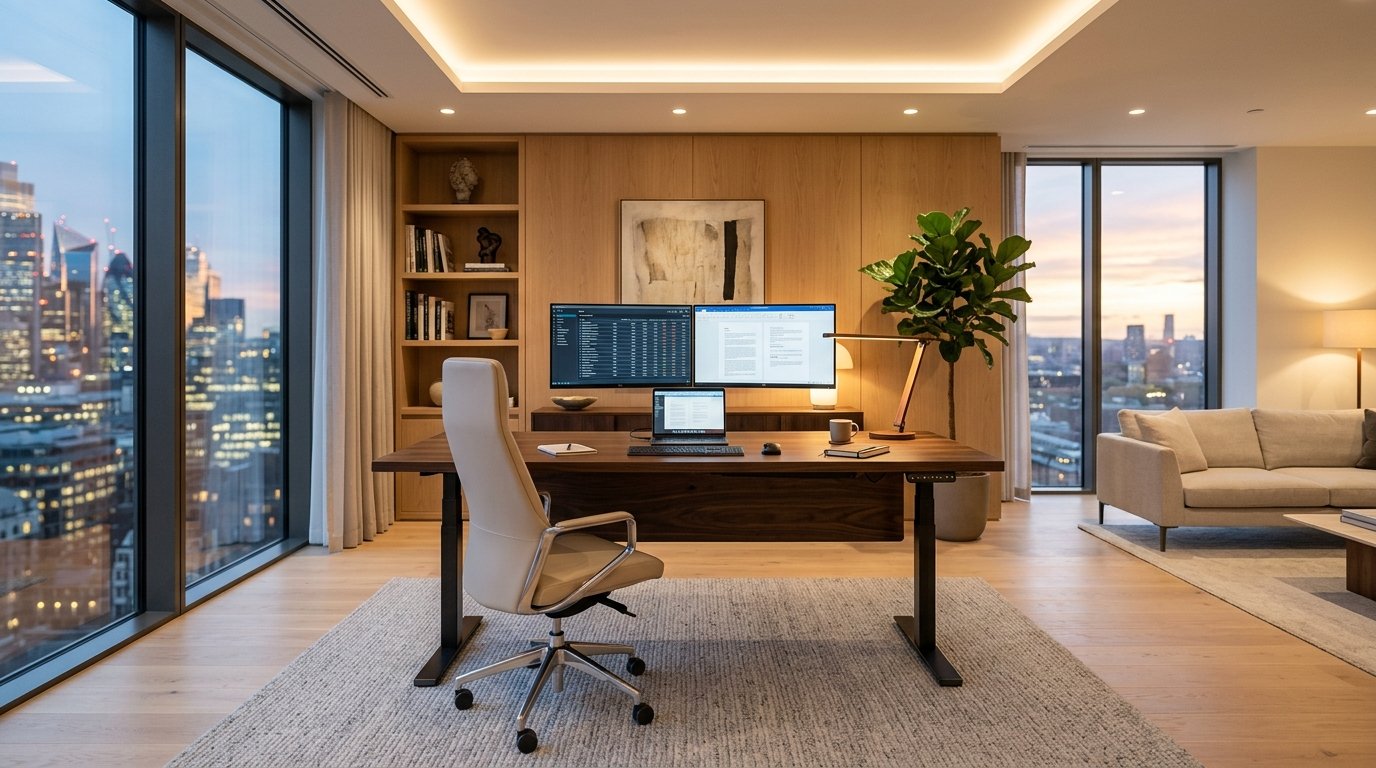
Wellness or quiet rooms want softer, muted tones with natural material cues, wood tones, soft fabric, never hard gloss. Executive offices can go darker and richer: walnut or deep brown desks like Vision’s IN EXECUTIVE, ULIX EXECUTIVE, or OBOL EXECUTIVE lift desks read as grounded and deliberate, but as a general principle it’s worth balancing a dark desk with a lighter chair fabric or lighter flooring so the room doesn’t feel closed-in. For a deeper dive into that specific balance, check our CEO office design guide.
Beyond the Desk: Color Across Chairs, Partitions, and Storage
Competitors stop at the desk. That’s a mistake, because chair upholstery color sits closest to your body and stays in your peripheral vision constantly, which arguably matters more day to day than the desktop you glance down at.
Leather and leather-look chairs read very differently depending on tone. Dark leather, like Vision’s Ferine, Trivaro, and Sovante models, reinforces an executive, grounded feel. As a general rule, lighter leather tones feel more open and approachable, which tends to suit a collaborative manager’s office better than a C-suite corner.
Partitions, storage, and accessories
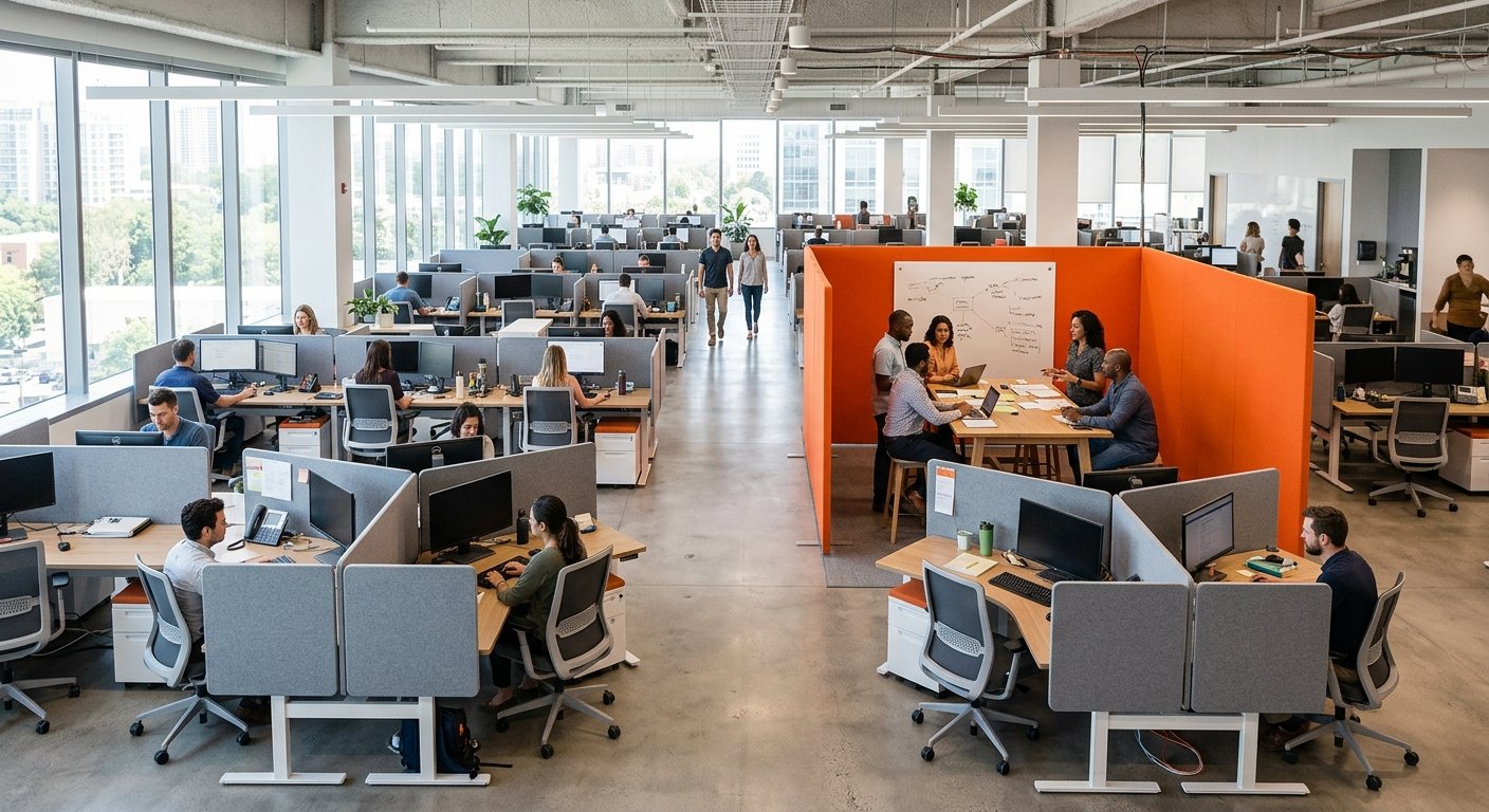
Partitions and acoustic screens in muted tones reduce visual clutter in open-plan layouts. Bold screen colors, on the other hand, can be used deliberately to zone a space, marking a collaboration pod in orange versus a quiet pod in cool grey. If you’re planning an open-plan layout, this pairs naturally with choosing cubicles that protect focus without isolating teams.
Filing cabinets and storage are easy to overlook, but because they occupy large flat surfaces at eye level, their color carries an outsized visual footprint relative to their actual function. Steel file cabinets, like Vision’s VS111, VS112, VS113 range, are worth matching deliberately to the room’s palette rather than treating as an afterthought. And if you’re not ready to commit to large furniture purchases, accessories like Vision’s LOTUS, MIX SCREEN, and Ocurra panels are a practical way to test a color strategy first.
How Color Interacts with Lighting and Biophilic Design
The same furniture color reads completely differently under warm 3000K lighting versus cool 5000K lighting. If you’re picking a color from a showroom sample or a catalog photo, test it under your actual office lighting before you order. This single step avoids most expensive color mistakes.
Rooms with abundant daylight can carry darker furniture tones without feeling heavy. Windowless interior rooms need lighter tones, or they start to feel cramped no matter how good the layout is on paper.
Wood-tone finishes and green accents reinforce each other for a biophilic feel, but only if the wood tone is real or convincingly realistic grain, not a flat printed laminate. Texture is what sells the natural association; color alone doesn’t do it.
Reflective or high-gloss finishes amplify whatever light exists in a room. That’s an asset in a dim space and a liability on an already bright, glare-prone desk near a window. Match the finish to the light you actually have, not the light you wish you had.
Color Choices for Hybrid Offices and Multi-Generational Teams
A single bold color scheme across an entire open-plan floor risks alienating part of your team, and that risk is bigger than most planners assume. Preferences for bold versus muted color genuinely vary across age groups and roles.
Hybrid offices used by rotating teams benefit from a neutral furniture base with color introduced through movable accessories, screens, cushions, rather than committing the whole floor to one aesthetic preference. Nobody should feel like the space was decorated for someone else’s taste.
Hot-desking and drop-in zones work better with color-coded by zone type (focus, collaboration, call) rather than color chosen for an individual’s preference, since the same furniture serves different people across the week. For more on this layout challenge specifically, see our guide on open plan versus private office furniture choices.
The palette that ages best: two or three core neutrals plus one or two accent colors confined to soft goods, cushions, chair fabric, screen panels, rather than structural furniture, since trends shift faster than a desk or cabinet should need replacing.
A Practical Framework for Choosing Furniture Colors, Zone by Zone
Pull all of this into a checklist you can actually use when specifying furniture:
- Identify the primary task of the zone (deep focus, collaboration, reception, wellness, executive) before picking any color at all.
- Check the zone’s lighting conditions, daylight-rich versus windowless, warm versus cool bulbs, and adjust tone and finish accordingly.
- Pick one neutral base color for large structural pieces (desks, storage, partitions) per zone, and reserve bold or saturated colors for small accents only, one chair, one screen panel.
- Match material and texture to color intent: real wood or wood-look for warmth, matte finishes for glare-sensitive desks, leather for executive weight.
- Prototype with movable accessories before committing to large furniture orders, especially in hybrid or shared-use spaces where preferences vary.
If you’re standardizing color and material across an entire office in one order, that’s exactly where working with a single manufacturer pays off. Vision’s collections span office chairs, desks, sofas, cabinets, and meeting tables with OEM/ODM production, so a reception’s brand-coordinated neutral and an executive suite’s deep walnut can come from the same supplier, built to the same quality standard, and backed by warranty and spare-part support on every order.
Frequently asked questions
What is the best color for an office desk?
A matte, neutral tone (grey, taupe, or walnut) is generally best for desks, especially in screen-heavy roles, because it reduces glare and contrast between the desk surface and the laptop screen. High-gloss white and very dark matte-black are both harder on the eyes over a full workday.
Does office chair color really affect productivity?
Chair color doesn’t directly boost output, but it sits in your peripheral vision constantly and affects how calm or stimulated a space feels over hours of use. Darker leather chairs read as grounded and formal; lighter tones feel more open and approachable, which matters more in shared or collaborative roles.
Should every room in an office use the same color scheme?
No. Match furniture tone to the task of each zone: cool, muted colors for focus areas, warmer tones for collaboration spaces, and a brand-coordinated neutral for reception. A single scheme across a whole floor often ignores how differently each zone is actually used.


